Rebranding a top-tier global HR recruiter
Brand
Digital

Standing out in an established field. Battery manufacturing is dominated by large, established players with long track records and an industrial look to match. Xerode is the newcomer, and it needed to be taken seriously without looking like everyone else. The identity had to do two things at once. It needed to be distinctive enough to be remembered in a crowded, familiar-looking market, and clear enough that a customer, investor or partner understands what Xerode does at a glance. Technical credibility and a genuinely different point of view, in one brand.
Powder is the core material of the technology, which resulted in the tagline Powder Power. One idea could give Xerode both distinction and clarity. Powder sits at the heart of what Xerode does, so building the identity around it meant the look and the message were the same thing: striking to look at, and a direct statement of what the technology is. We decided to go all in on it and build the whole identity around that one clear idea. The aim was an identity that is unique, striking and cohesive, showing what Xerode does before you read a word.
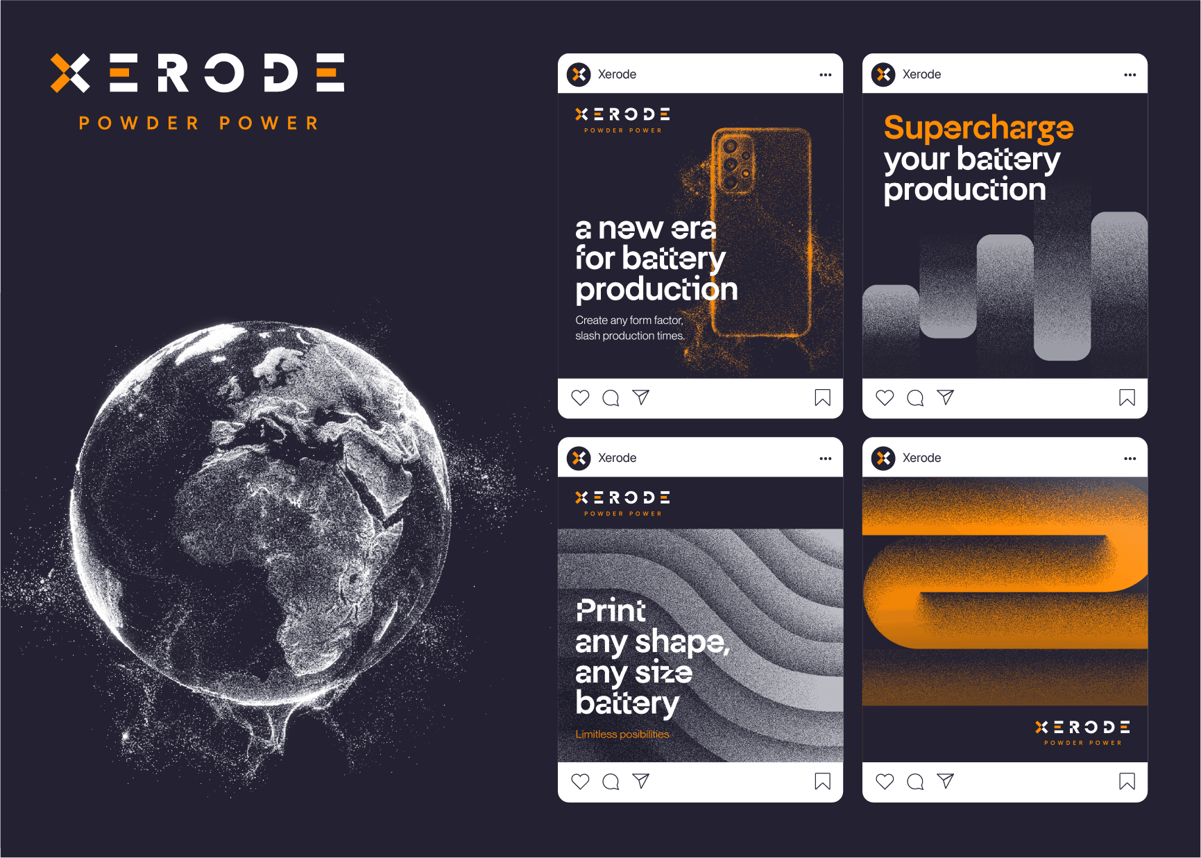
Abstract, layered forms reference both the printing process, built up layer by layer, and the ability to make a battery in any form factor. A stipple texture runs through every element, so each shape looks as if it has been composed from individual powder particles. Photography and visuals are crafted to look as though they've emerged directly from powder, which keeps the material at the heart of everything.